TikTok Search Redesign—
Envisioning the ideal search experience.
Overview—
Being an active user of TikTok, I found that a lot of times I know what I want to search for, but it's hard for me to describe it in words. I initiated this project as an opportunity for me to envision a new process for searching in TikTok. To reduce the difficulty of searching for videos and improve the matching of search results, I added a new feature of "visual search" to TikTok, allowing users to search through images. I also made some iterations to some details in the original search process, allowing users to personalize their search page.
My Role —
This is a 5-day long design challenge. I owned and involved in every step of the design process, including research, ideation, creating wireframes, usability testing, and designing high-fidelity UIs.
Role
UX Designer
Duration
5 Days
Design Process —
Final Design
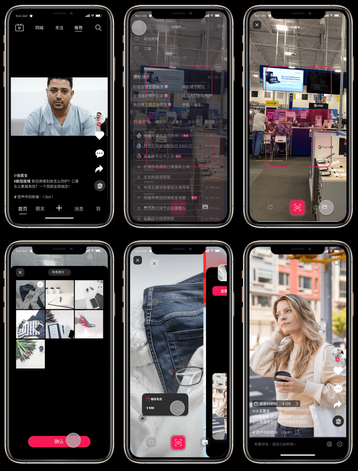
Searching with visual elements
• Allow users to search by scanning items in real life.
Users can also select pictures in their album to use visual search.
• Provide multiple recognition results at the same time
• Multiple filters under the recognition result page, providing users
with more result choices
DAY 1 Understanding
Secondary Research
“HOW TO…?”
In order to understand the current utilization of Tiktok's "search" function and the keywords that users search frequently, I started by broadly looking at different aspects online, including the content, keywords, fields that users like to search. In the official 2020 Search summary report, I found that "How to...?" is the most frequently searched question by users. Compared with traditional search engines' search results in text and graphics, Tiktok's search results are presented in video format, which can make up for the visual and sound effects that graphics and texts cannot fully display, and it gives users more emotional value, adding a sense of credibility to the results. Similarly, in terms of timeliness and visualization, video search also has greater advantages, which makes searching in Tiktok stand out among many users.
For the search result's output being video format, the current input form of text search is more traditional, leading to a problem of content matching. Therefore, compared to the optimization of the traditional UI of the "search" interface itself, I think it is more important to imagine a search method that is more efficient than text search to improve the quality and matching of search results. The major focus of this project would be less about interface redesign but more about:

How might we envision an efficient and unique way of searching in Tiktok?
Interviews
What do I know vs. What do I need to know
I generated a list of research questions as a guiding outline before conducting user interviews. There are three major areas I focused on: existing searching method, usability, and experience.
I interviewed 5 Tiktok users with different age groups and interests. The purpose of these interviews is to understand the process of using the "search" function of Tiktok and to identify pain points and opportunities based on their experiences. Additionally, in order to fully understand the overall experience of the "search" function, I interviewed two Tiktokers and got insights from them about what they care about most when searching on Tiktok.
●Insight 1
There are many limitations in the current form of text-based search.
Keywords matching is the only way for users to search videos on Tiktok. The system will search for videos by matching the entered keywords to the introduction, hashtags, and subtitle information of the existing videos. However, it is difficult for users to find the exact matches due to the user's inability to define keywords, the lack of text information of existing videos and so on.
●Insight 2
The main way for searching on Tiktok should be the content of the video itself rather than the text description.
After communicating with users about their search process, I found that when users cannot accurately describe the video with keywords, users often have assumptions about the content of the video itself, and users usually have related images/video materials. In addition to text information such as keywords and subtitles, we should also allow users to search through images/videos to further improve the quality of results matching.
DAY 2 Define
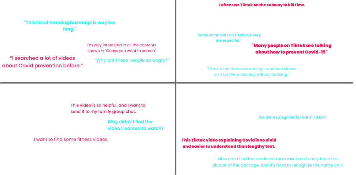
Empathy Map
Having conducted research, in order to organize my insights, I used the empathy mapping method to group related behaviors users had across my research and understand common themes. I started off collecting my thoughts using Miro, before moving on to using Figma to digitize our findings for better discovery later.
DAY2 Define
Journey Mapping
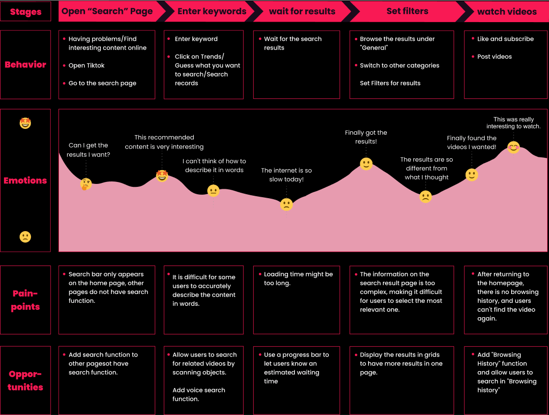
Using my research, I formed a journey map consisting of stages, actions, emotions, user goals, problems, and opportunities associated with the process.
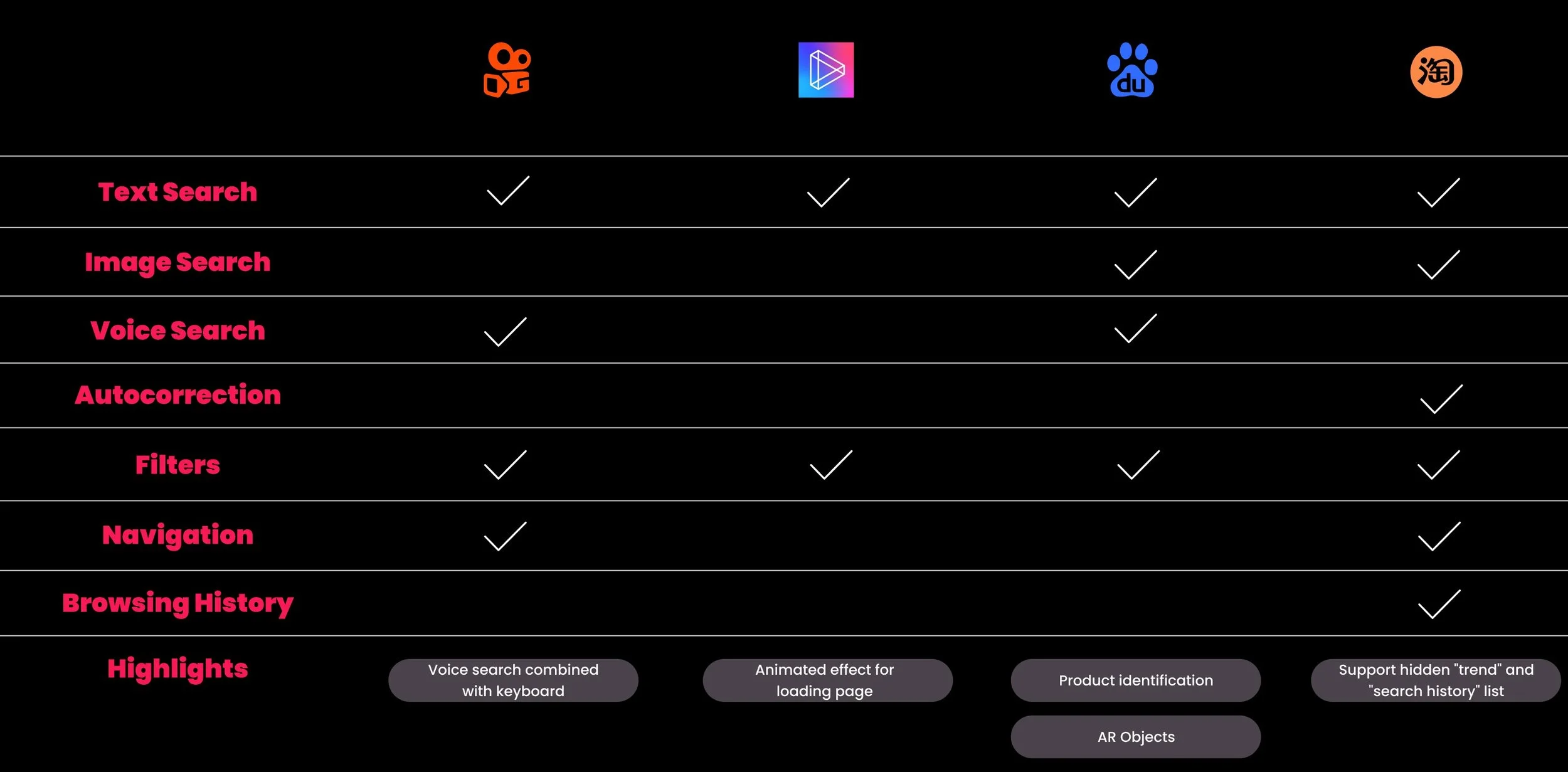
COMPETITIVE ANALYSIS
To understand what other platforms are designing their search functions to improve the matching rate of search results, I compared and analyzed four direct and indirect competitors. The search function is widely used by many apps, so there were a lot of resources I could learn from - from direct competitors to search engines.
DAY 3 Sketch
Ideation
Reimagine the "Search" experience
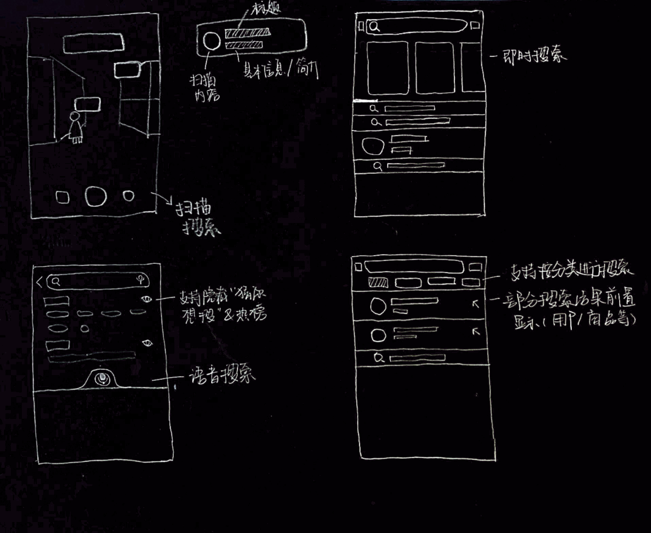
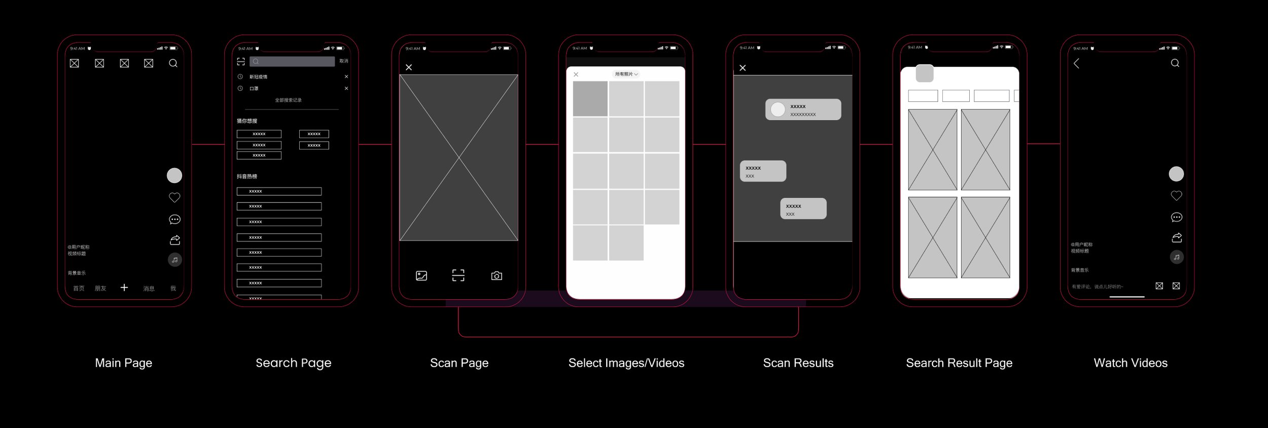
Based on my research and insights, I conducted two brainstorming sessions to come up with possible design solutions. Then I created low-fi wireframes to demonstrate my ideas and conducted 3 speed-dating sessions for the purpose of need validation and ideation. In the end, I decided to add a "scan search" function to Tiktok's search page.
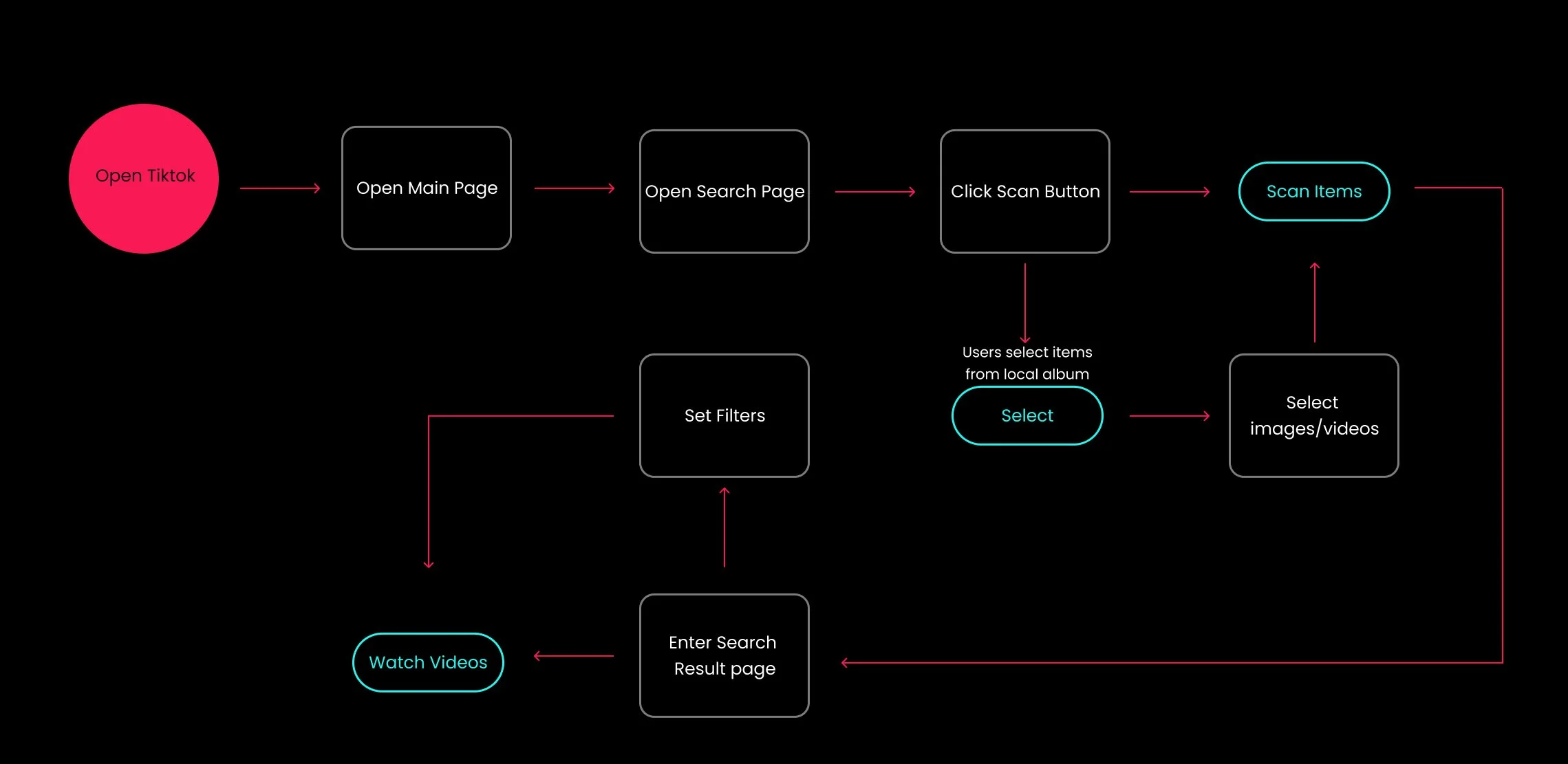
To make it easier to search for videos and improve the matching rate of search results, I have reorganized the user's "search" flow.
Current search process -
Confirm Keyword - Enter Keyword - Set Filters - Watch videos
New search process -
Scan items - Set Filters - Watch Videos
User Flow
DAY 4 Lo&Hi Fi
Lo-Fi Wireframes
Usability Testing
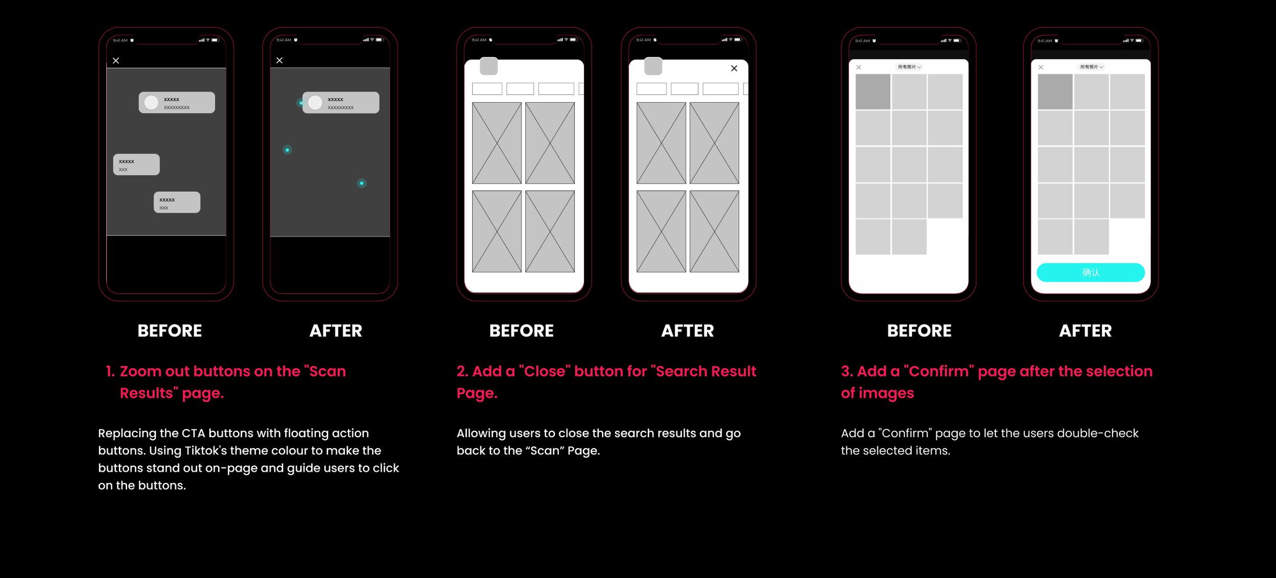
After creating the lo-fi wireframes, I conducted usability testing with three potential users to get feedback about the interface and design flow. I got constructive feedbacks and suggestions which helped me get lots of insights and findings. After the usability testing, based on the notes I took during the sessions, I reiterated the mid-fi screens.
Change as follows:
Zoom out buttons on the "Scan Results" page.
Added a "Close" button for "Search Result Page.
Added a "Confirm" page after the selection of images
DAY5 Final Design
Iterations
Hi-Fi Prototype
Reflection
Learnings
Use the Internet effectively.
I struggled a lot during the research phase trying to come up with a specific user group for this design challenge. However, the user base of Tiktok China is too large that I can't include all types of users in my research process. So I started this project by broadly looking online, and I found a lot of concrete research conducted for Tiktok, which was crucial for this project. I learned how powerful the internet could be when designing for a large demographic product.
Next Step
Possible business opportunities?🧐
Tiktok China is expanding their service of its "Tiktok Mall", an online shopping service in the Tiktok App. And this "Scan Search" function might be able to help with expanding it.
By allowing users to search by scanning products, we can help users find videos related to a specific product more accurately. Users then can get to know more about some product without knowing its name. This function could be beneficial when searching for clothing and home decors.
I would love to take this project further by exploring if "scan search" can be combined with the current "Tiktok Mall" service to help users find the desired products.


